Creating Themed Signs With A Difference
Branding is a big part of marketing, but branding doesn’t mean that everything in every location has to be the same. A great example of this concept is the variety of different signs we have completed for Toppers Pizza Place with locations in Ventura County and Santa Clarita, California.
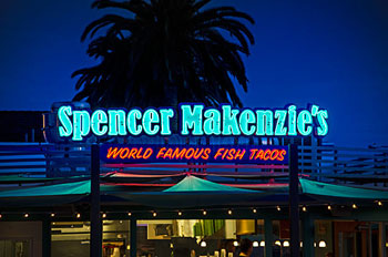
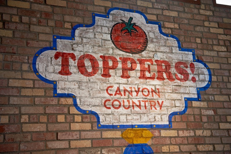
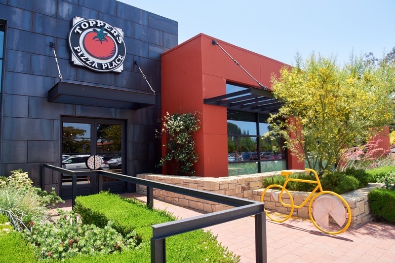
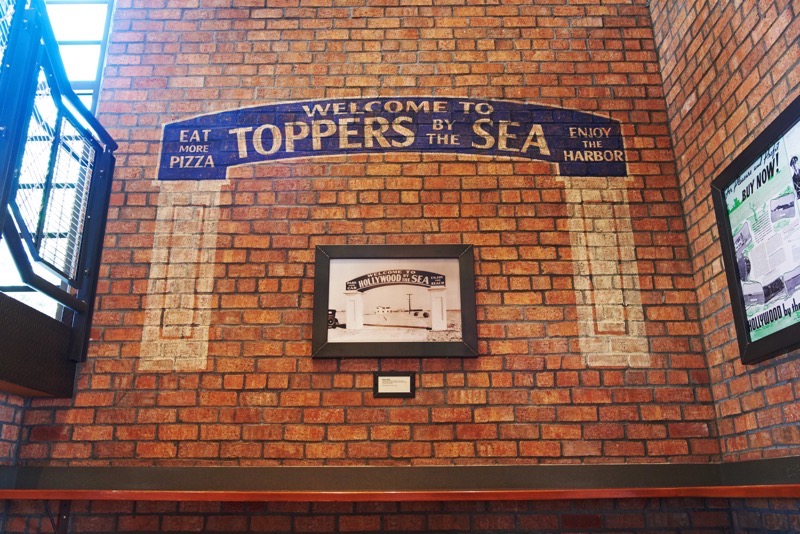
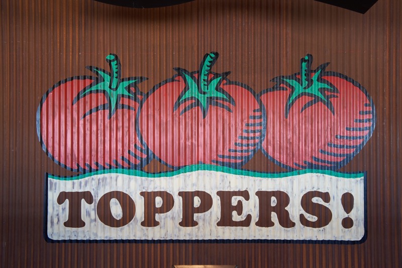
We have carefully designed all of the different signs we have made for Toppers to have the same feel and general design elements, but they are also each unique and different. We have worked with Toppers Pizza to include a variety of different signs from painted mural types of signs to printed signs, channel letter signs and some amazing neon signs.
The beauty of this option for branding and marketing is the visual experience for the customers. They can easily identify a Toppers Pizza, but they also have a distinct impression of each restaurant. They know the quality they can expect, but they also see each location as unique and different, not part of one big corporate chain.
Our Difference
When the management at Toppers first contacted Dave’s Signs, they were looking for a sign company that could do it all. They wanted not only design for the signs but also fabrication, installation and ongoing service for the signs. Additionally, they didn’t want to deal with all the hassle of permits and ensuring the signs met all regulations, so they really needed a company with experience in taking their sign ideas from concept to reality.
With our experience, we were able to work directly with their team to create unique signs for each of the 9 locations. This included working directly with the contractors upgrading the restaurants as many of the buildings were completely renovated.
We were able to work seamlessly with the contractors, and to ensure that both the inside and outside signs were completed on time and with the style that the Topper’s team wanted.
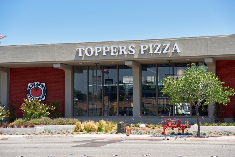
The next time you go into a Toppers Pizza Place stop and take a close look at the signs, murals and lettering. You will see a variety of different looks from retro and classic to modern and streamlined. Featured prominently all designs are the Toppers logo and the big, red tomato that is a key part of the brand.
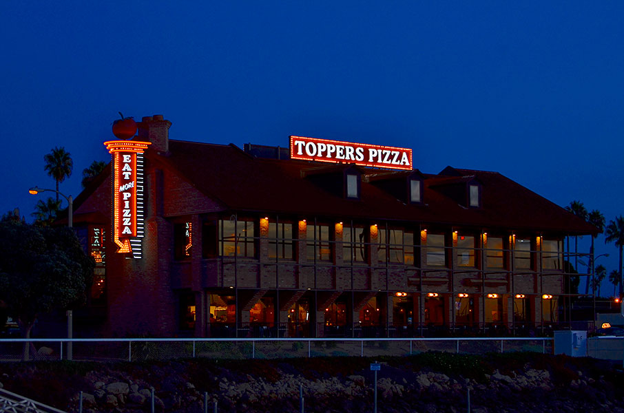
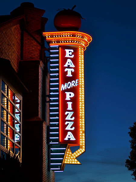
For a great look at night be sure to check out the iconic neon signs we have designed for Toppers at Channel Islands Harbor. It is a retro looking sign with the arrow, the Eat More Pizza message and the classic tomato on top, just another touch of branding that is sure to bring a smile.
If you are a business owner looking for a sign company that can do it all and work with your contractors. Look no further than Dave’s Signs. Call us at (805) 641-1387 or reach out to us online.