Call us at (805) 641-1387


Call us today for an Estimate at (805) 641-1387 or

Request a Quote Online

Call us at (805) 641-1387


Temporary Business Signs: What to Use Before You Open

Opening a new business, renovating a storefront, or preparing a commercial property for tenants takes time. Permanent signage may still be in design, waiting for permits, or scheduled for fabrication and installation.

But that doesn’t mean your storefront or building needs to sit unnoticed in the meantime.
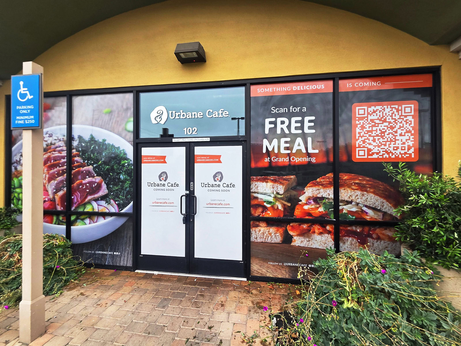
Coming-soon window graphics featuring food photography, grand opening promotion, and QR code at Urbane Cafe in Goleta, CA.
Custom coming-soon window graphics designed, fabricated, and installed by Dave’s Signs for Urbane Cafe in Goleta, CA, promoting the restaurant’s upcoming opening.

Temporary business signs let you introduce your brand, announce an upcoming opening, promote available space, and start building awareness before your permanent signs are ready.

For restaurants and retail businesses, that might mean coming-soon window graphics or a large storefront banner. For property managers and developers, it could mean leasing banners, construction fence graphics, or branded barricades that help people understand what’s happening at a property.

The right solution depends on your location, how long you need the signs, and what you want passersby to know.

Here are four common temporary signage options, along with real projects Dave’s Signs designed, fabricated, and installed.

1. Coming-Soon Window Graphics

Storefront windows are valuable advertising space, especially when a business is preparing to open.

Instead of leaving windows empty or exposing an unfinished interior, temporary window graphics can introduce the business and give people a reason to look forward to the opening.

Depending on the design, window graphics can include:

  • Business name and logo
  • Coming-soon announcements
  • Product or service photography
  • Grand-opening promotions
  • Website addresses and QR codes
  • Social media information

Window graphics can also provide privacy while construction or interior improvements are underway.

Depending on the project, temporary graphics may use removable adhesive vinyl, window clings, or other materials selected for the glass surface and expected installation period.

Project Example: Urbane Cafe — Goleta, CA

Urbane Cafe used its storefront windows to introduce the restaurant before opening.
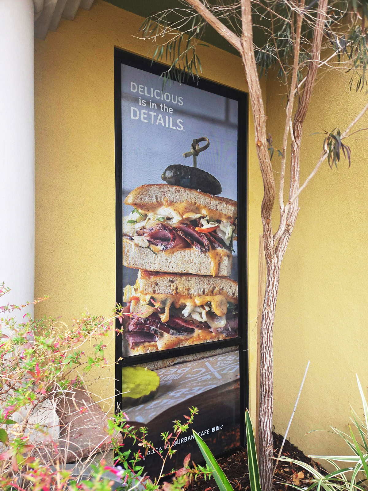
Custom window graphics featuring sandwich photography and “Delicious is in the Details” messaging at Urbane Cafe in Goleta, CA.
Custom window graphics designed, fabricated, and installed by Dave’s Signs for Urbane Cafe in Goleta, CA, showcasing the restaurant’s food and branding before opening.

Large food photographs immediately communicate what customers can expect, while the coming-soon messaging announces the new location. A QR code and grand-opening promotion give interested customers a way to engage before the restaurant opens.

The graphics also cover much of the storefront glass, helping conceal the interior during preparations.

Why it works: The storefront starts introducing the business to future customers before opening day, turning otherwise unused window space into an opportunity to build interest.

2. Temporary Banners for Buildings and Storefronts

Banners are one of the most flexible and cost-effective temporary signage options.

They can be produced in a variety of sizes and installed in suitable locations, including building exteriors, storefronts, fences, and other approved structures.

Businesses commonly use temporary banners to announce:

  • New locations
  • Grand openings
  • Relocations
  • Temporary business identification
  • Leasing availability
  • Upcoming developments

For outdoor applications, vinyl banners are a popular option because they can accommodate large graphics and are available in materials designed for exterior use.

However, the location matters. In coastal areas such as Ventura and Santa Barbara, sun exposure, moisture, and wind can affect material selection and installation methods.

A banner mounted high on a building may require a different approach than one installed across a storefront.

The design is just as important as the material.

For a banner to be effective, the message should be easy to understand from the intended viewing distance. Large lettering, high-contrast colors, and a simple layout generally work better than trying to include too much information.

Project Example: Panorama Riverpark — Oxnard, CA

At Panorama Riverpark, Dave’s Signs designed, fabricated, and installed a large temporary building banner displaying a prominent “NOW LEASING” message near the top of the property.

The banner uses the building’s height to deliver a straightforward message to people approaching or passing the development.

Rather than trying to communicate every detail about the property, the design focuses on the information potential tenants need to notice first.

Why it works: The large lettering communicates the property’s leasing status without requiring people to stop and read a detailed advertisement.
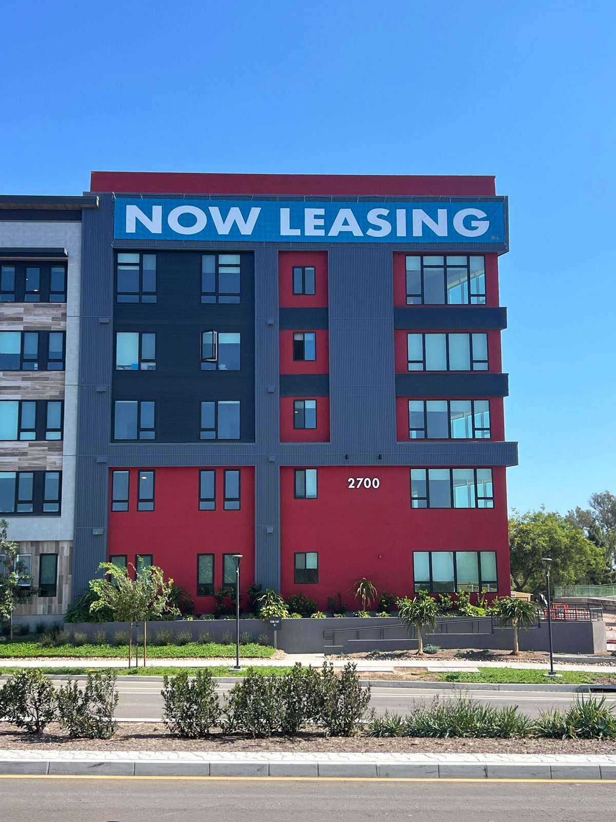
Large temporary NOW LEASING building banner installed at Panorama Riverpark in Oxnard, CA.
Large temporary building banner designed, fabricated, and installed by Dave’s Signs for Panorama Riverpark in Oxnard, CA, promoting leasing opportunities.

3. Construction Fence Banners and Graphics

Construction fencing is often one of the first things people notice at a property undergoing renovation or redevelopment.

Although the fencing serves a practical purpose, it can also provide an opportunity to communicate what’s happening behind it.

Printed construction fence banners can announce future tenants, display architectural renderings, promote leasing opportunities, or simply provide a more attractive appearance during construction.

For commercial properties, this type of temporary signage can be especially useful when the finished building or tenant space isn’t yet visible.

It gives property managers and developers a way to showcase what’s coming rather than leaving visitors to guess.

Materials and installation methods should also account for how long the fencing will remain in place and the site conditions. Wind exposure is particularly important when installing large graphics on temporary fencing.

Project Example: Ventura Harbor — Ventura, CA

At Ventura Harbor, Dave’s Signs designed, fabricated, and installed temporary banners along construction fencing to announce a future waterfront restaurant space.

The graphics include a coming-soon message, leasing information, and an architectural rendering illustrating the planned development.

Instead of leaving visitors looking only at construction fencing, the signs help explain what the project will become.

Why it works: The graphics turn a construction barrier into an opportunity to communicate the project’s plans and generate interest in the available space.
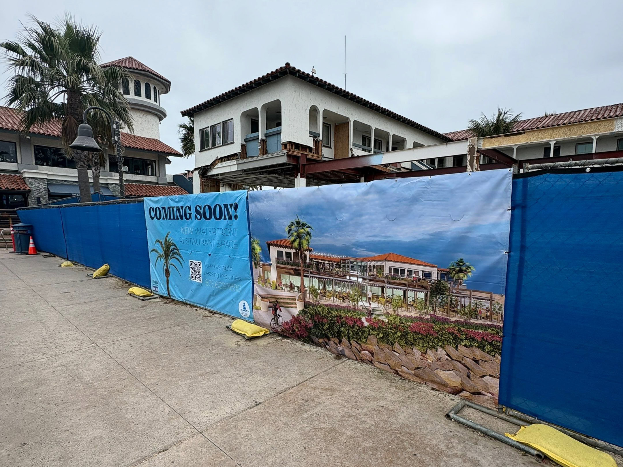
Temporary construction fence banners featuring a coming-soon announcement and architectural rendering of a waterfront restaurant at Ventura Harbor in Ventura, CA.
Coming-soon construction fence banners designed, fabricated, and installed by Dave’s Signs at Ventura Harbor in Ventura, CA, showcasing plans for a new waterfront restaurant space.

4. Branded Construction Barriers and Barricades

For restaurants, retail stores, and commercial properties, temporary construction barriers can do more than separate the public from an active work area.

When designed with the business in mind, these surfaces can reinforce the brand, preview products or services, and build anticipation for an upcoming opening.

Branded barricades are especially useful in locations where customers and pedestrians regularly pass an active construction area.

Instead of a blank wall, the business can use the space to show what customers can expect once the location opens.

Depending on the project, barricade graphics may feature large-format photography, logos, opening announcements, and other brand messaging.

Project Example: Finney’s Crafthouse — Las Vegas, NV

At Finney’s Crafthouse, Dave’s Signs designed, fabricated, and installed branded construction barricade graphics featuring food photography, restaurant branding, and messaging about the upcoming location.

The graphics give people a preview of the restaurant while construction continues behind the barrier.

They also help establish a recognizable brand presence before the permanent exterior signs are installed.

Why it works: The temporary barrier becomes part of the restaurant’s opening campaign rather than simply hiding the construction area.
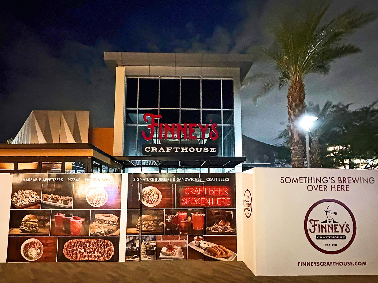
Branded construction barricade graphics featuring food photography and restaurant signage for Finney’s Crafthouse in Las Vegas, NV.
Custom construction barricade graphics designed, fabricated, and installed by Dave’s Signs for Finney’s Crafthouse in Las Vegas, NV, showcasing the restaurant’s food and branding before opening.

5. Planning Temporary and Permanent Signage Together

Temporary signs are often needed because permanent signage takes longer than expected.

Depending on the project, permanent signs may require landlord approval, city permits, electrical work, fabrication, and installation scheduling.

Thinking about temporary and permanent signage together can help avoid a period when your business has little or no identification.

Before ordering temporary signs, consider the following:

How long will you need them?

A banner needed for a few weeks may require a different material or installation approach than graphics expected to remain in place for several months.

The anticipated timeline can influence which materials are appropriate and how to install the signs.

Where will people see them?

Think about how customers will approach the property.

A sign intended for passing vehicles needs a different layout and lettering size than window graphics viewed by pedestrians.

Distance, viewing angle, surrounding buildings, and lighting can all affect visibility.

What is the most important message?

Are you announcing an opening, promoting available space, or identifying a temporary entrance?

Focus on the information people need most.

A clear “COMING SOON” or “NOW LEASING” message may be more effective than a sign filled with detailed information that people don’t have time to read.
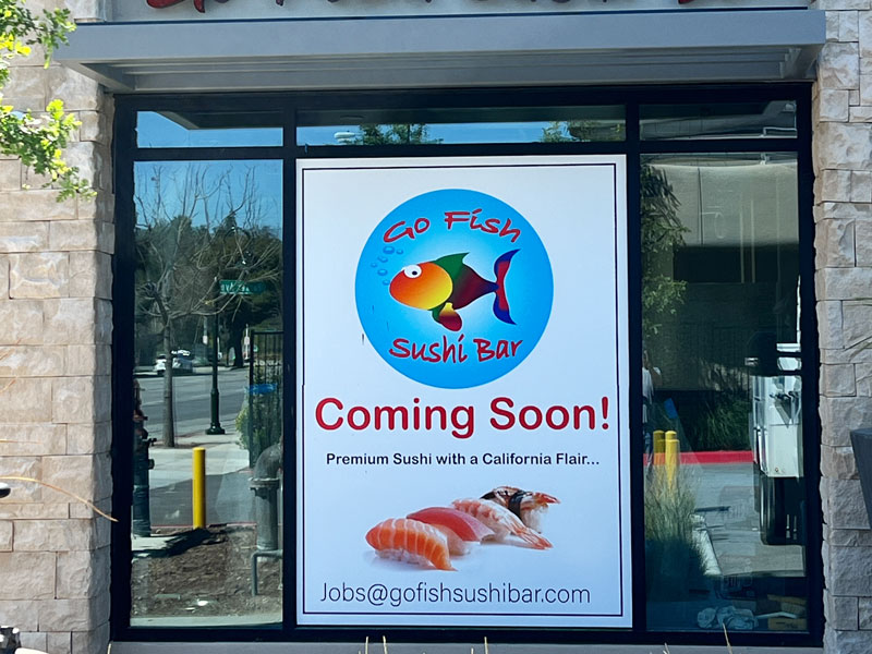
Coming-soon window graphic featuring the Go Fish Sushi Bar logo, sushi photography, and opening announcement in Thousand Oaks, CA.
Custom coming-soon window graphic for Go Fish Sushi Bar in Thousand Oaks, CA, introducing the restaurant and building awareness before opening.

What’s your budget?

Temporary signage can be a cost-effective way to promote a business before permanent signs are ready, but costs vary by project.

Materials, size, design, installation requirements, and the expected lifespan of the signs can all influence the final price.

A simple vinyl banner may work for one location, while customized window graphics or large-format construction signage may be better for another.

Will the property allow them?

Temporary signs may still require city permits or landlord approval.

Regulations can limit the size, placement, duration, and type of signage permitted on a property. Some cities also have specific rules for window coverage, temporary banners, and signs placed near public sidewalks.

These requirements can vary significantly between cities, even within the same county.

Confirm the applicable regulations before production or installation.

What happens when the permanent signs are installed?

Temporary signs should be part of the overall signage plan, not something considered only after a delay occurs.

Coordinating their removal or replacement with permanent sign installation can help make the transition easier.

It also allows the business to maintain a consistent appearance from the initial coming-soon announcement through opening day.

Temporary Doesn’t Have to Mean an Afterthought

Temporary signs may only be installed for a few weeks or months, but they can serve an important purpose during that time.

Whether you’re opening a restaurant, renovating a storefront, leasing a commercial property, or developing a new building, temporary signage can help people understand what’s happening and what to expect.

It can also start introducing your business to potential customers long before your doors open.

The best approach is to consider your location, audience, timeline, budget, and permanent signage plans before deciding which temporary signs make sense.
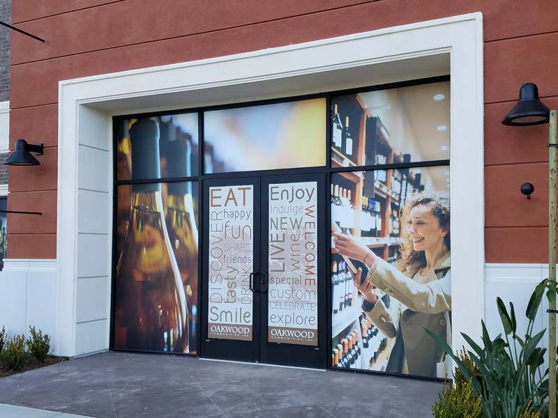
Custom storefront window graphics featuring lifestyle photography and promotional messaging for Oakwood Communities’ wine store in Oxnard, CA.
Custom window graphics for Oakwood Communities’ wine store in Oxnard, CA, featuring lifestyle photography and branded messaging that enhances the storefront’s appearance.

Planning a Temporary Sign Project?

Dave’s Signs designs, fabricates, and installs temporary and permanent commercial signage for businesses, property managers, and developers throughout Southern California.

From coming-soon window graphics and construction fence banners to large-format building signs, we can help you plan the right signage for your property and timeline.

We’d be happy to take a look and talk through the options.

Call us at (805) 641-1387, Request a Quote, or Contact Us online —whatever works best for you.
 

Illuminated Storefront Signs: A Guide to Better Nighttime Visibility

Your storefront sign has to work during the day, but for many businesses, its job doesn’t stop when the sun goes down.

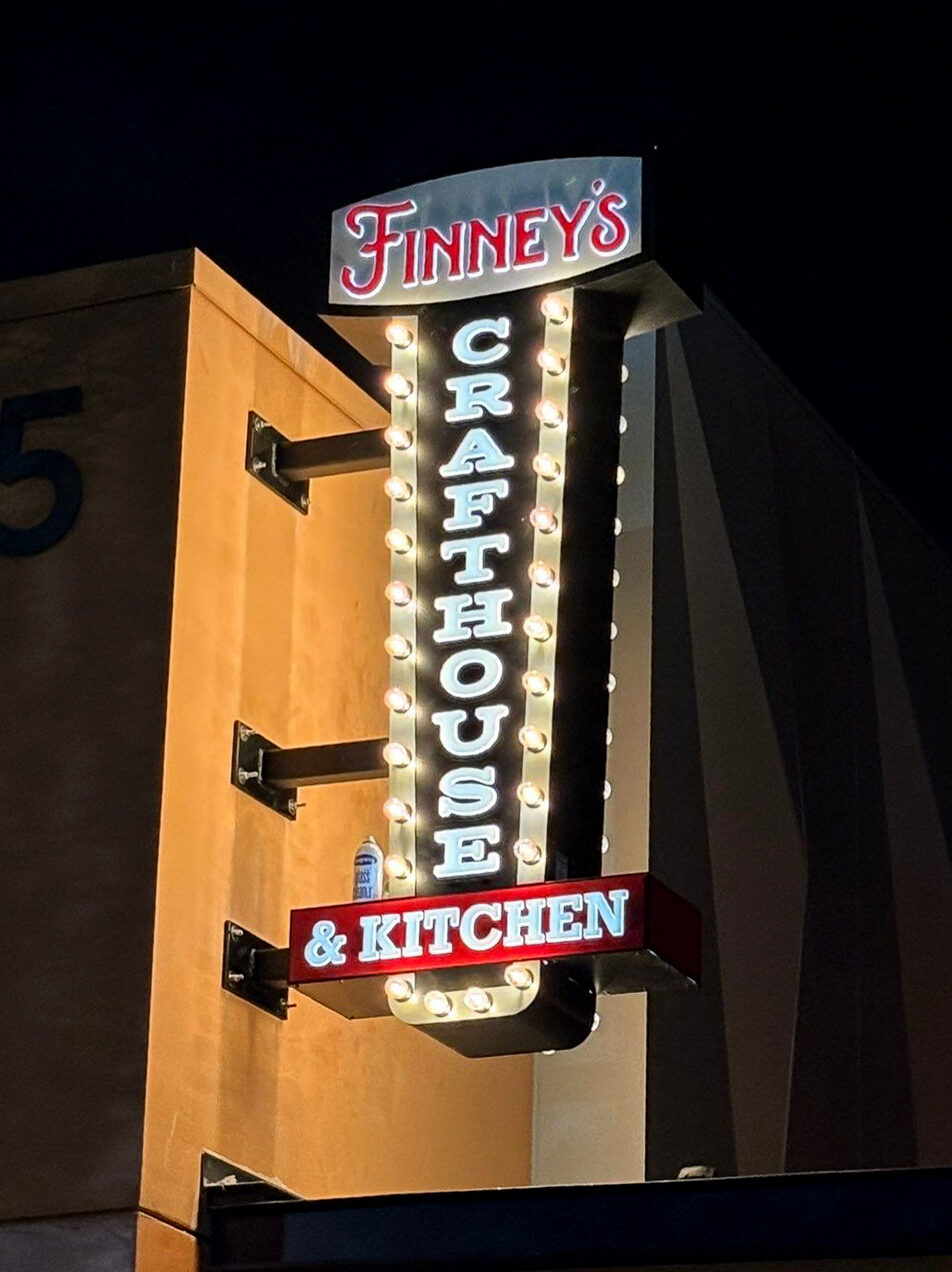
Finney’s Crafthouse & Kitchen illuminated blade sign at night in Las Vegas, Nevada
Finney’s Crafthouse & Kitchen illuminated blade sign provides strong nighttime visibility at its Las Vegas location.

Restaurants, retail stores, fitness centers, hotels, medical offices, banks, entertainment venues, and other businesses often depend on illuminated storefront signs to help customers find their location, recognize their brand, and distinguish the business from everything around it.

The key is not simply making a sign light up.

A good illuminated storefront sign is designed around the building, viewing distance, surrounding lighting, brand identity, and the way customers actually approach the property.

Why Storefront Lighting Matters

A storefront sign may look clear and attractive during daylight hours but become difficult to see after dark.

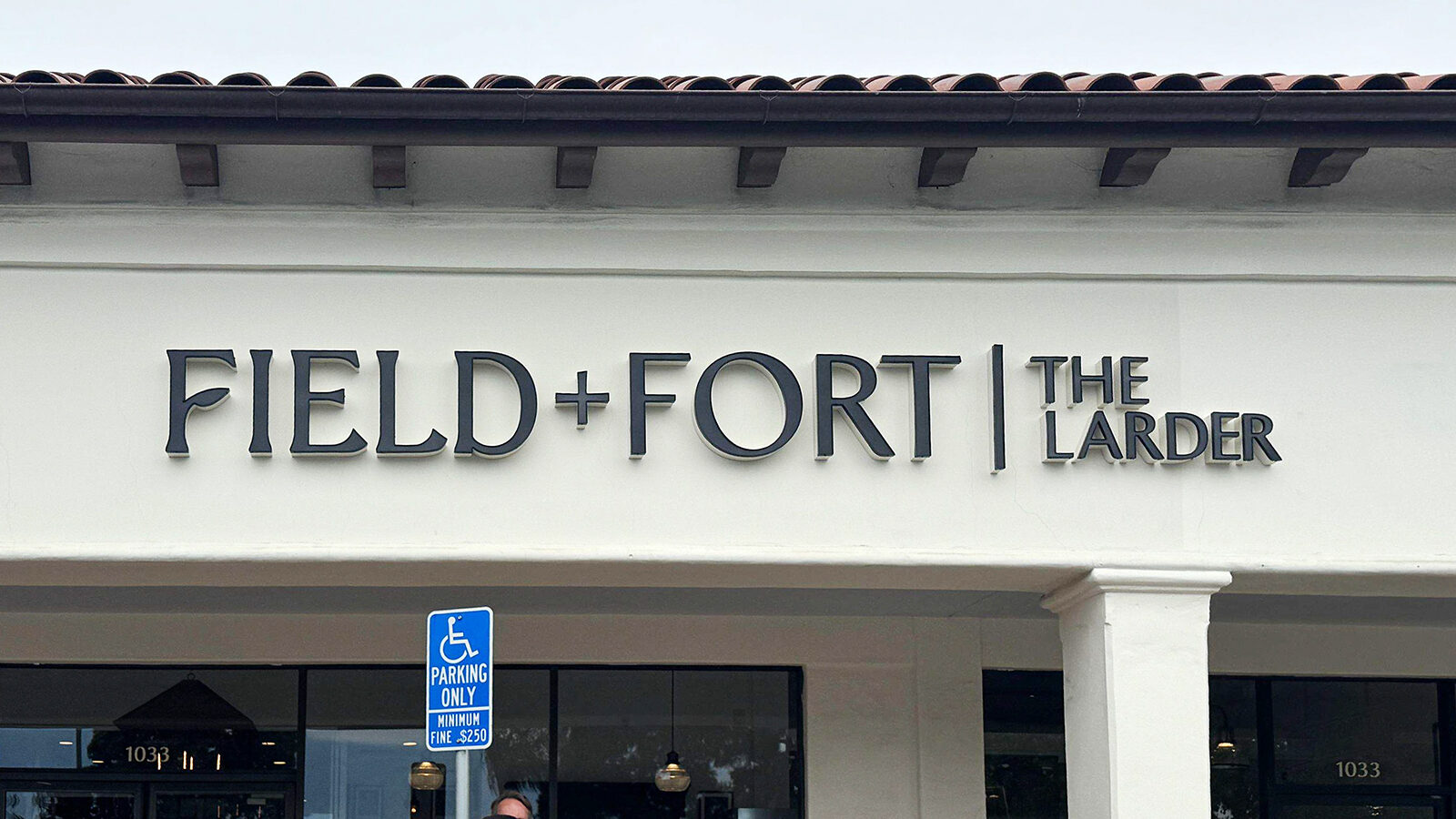
The Larder by Field + Fort channel letter storefront sign in Carpinteria, California
The Larder by Field + Fort storefront signage in Carpinteria during daylight hours.
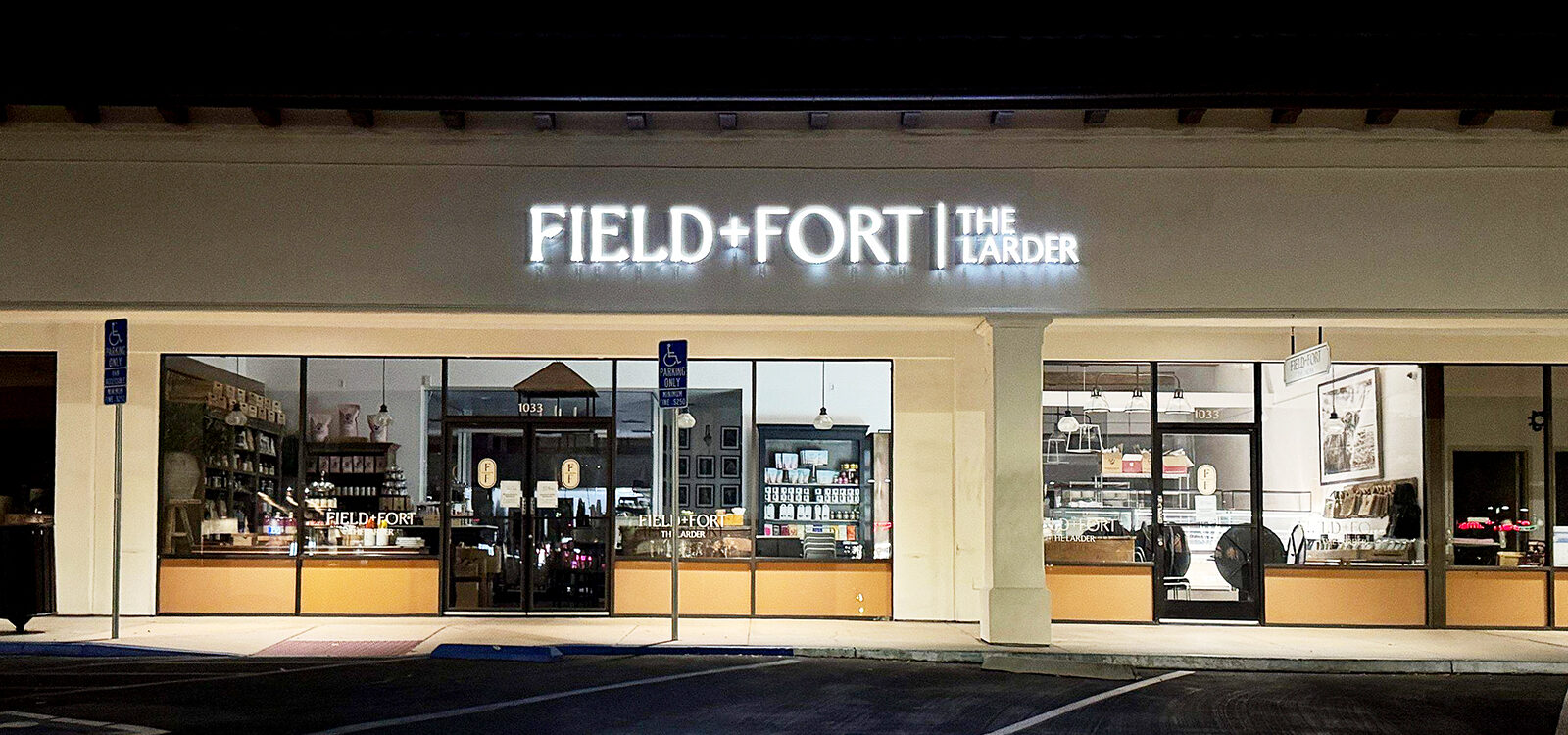
The Larder by Field + Fort illuminated channel letter storefront sign at night in Carpinteria, California
The Larder by Field + Fort channel letters remain clearly visible after dark in Carpinteria.

Illumination extends the sign’s visibility into the evening.

For businesses that stay open at night, that makes the location easier for customers to find. Even when the business is closed, an illuminated sign can continue building familiarity with people driving or walking past the property.

That repeated business visibility has value.

A customer may see your storefront dozens of times before they ever need what you sell. When the time comes, recognizing the business and knowing where it is can make the decision easier.

The goal isn’t to make the storefront as bright as possible.

It’s to enhance visibility and make the business easy to see, identify, and remember.

Design the Sign for Its Surroundings

One of the most important parts of designing illuminated exterior signs is understanding where they will be installed.

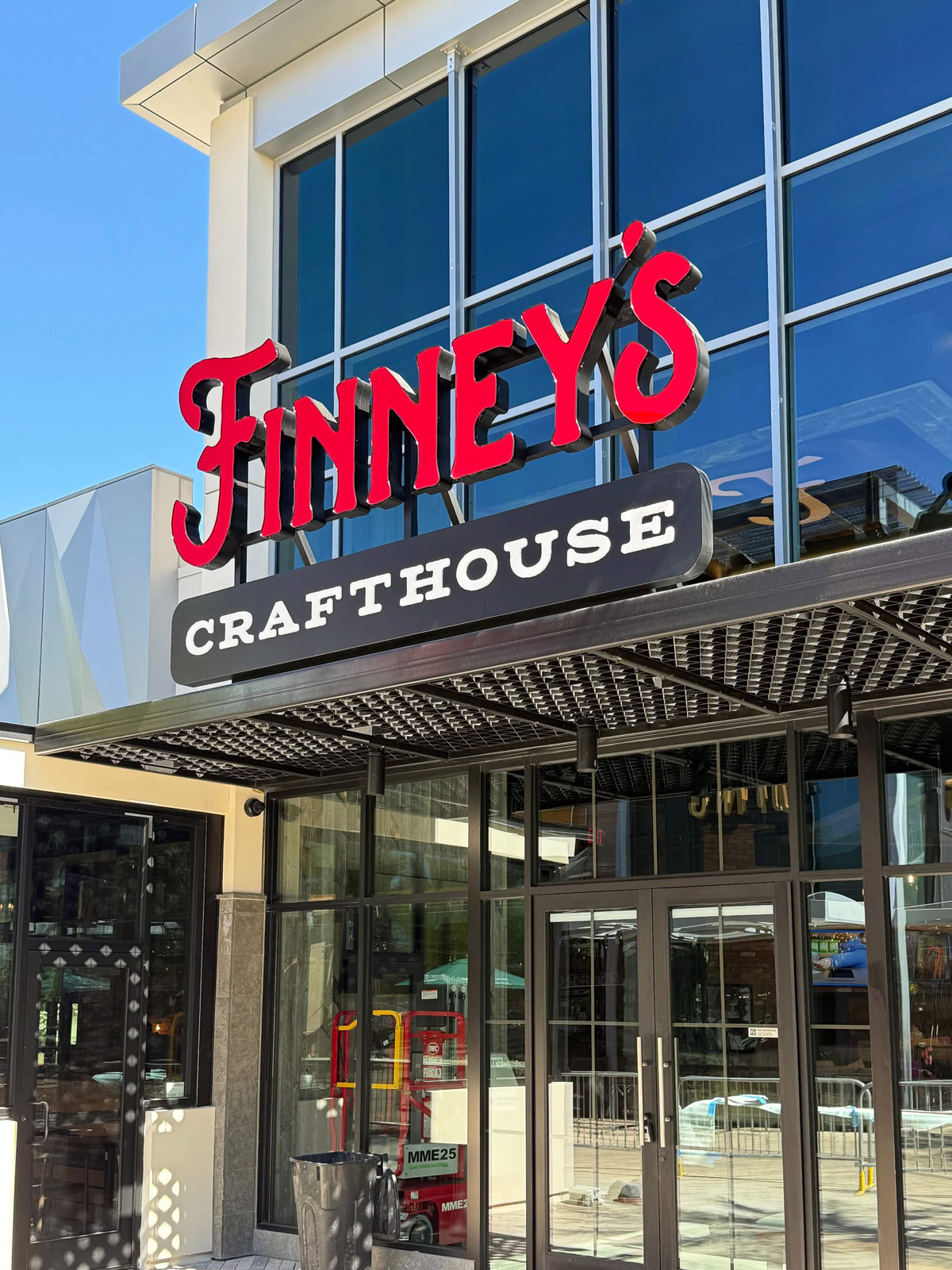
Finney’s Crafthouse & Kitchen storefront sign at its Las Vegas, Nevada location
Custom storefront signage for Finney’s Crafthouse & Kitchen at its Las Vegas location.

A sign on a darker standalone building has very different lighting requirements than a storefront surrounded by brightly illuminated businesses.

Viewing distance matters too.

Customers may be:

  • Driving past the building at street speed
  • Entering a shopping center
  • Looking across a large parking lot
  • Walking along a retail street
  • Trying to identify one business among several neighboring storefronts

The sign needs to communicate quickly from the places where customers are most likely to see it.

Letter size, spacing, contrast, sign placement, mounting height, building color, surrounding light sources, and illumination all affect visibility.

That’s why good storefront sign design starts with the property—not just the logo.

Choosing the Right Type of Illuminated Storefront Sign

No single lighting style works best for every business.

Different types of illuminated signs create very different appearances.

Margaret O’Leary illuminated blade sign in Montecito, California
An illuminated projecting blade sign helps identify the Margaret O’Leary storefront in Montecito.

Front-Lit Channel Letters

Front-lit channel letters are one of the most common choices for commercial storefronts.

The Ivy Mae illuminated storefront sign at dusk in Ventura, California
The Ivy Mae storefront signage remains visible as daylight fades in Ventura.

Each letter or brand logo element is individually fabricated and internally illuminated, so the sign face lights up at night.

These individual letters offer strong visibility and work well for many retail stores, restaurants, medical offices, financial institutions, and other commercial businesses.

Channel letters can also reproduce brand logos and colors while adding more dimension than a flat sign panel.

Halo-Lit or Reverse-Lit Letters

Halo-lit letters create a softer lighting effect.

Instead of primarily illuminating the face of the letter, light is directed toward the wall behind it, creating a warm glow around the lettering.

Bank of the Sierra front-lit and halo-lit channel letter sign
Bank of the Sierra channel letters combine front-lit and halo-lit illumination for nighttime visibility.

This can give the storefront a more architectural or refined appearance.

The effectiveness of halo lighting depends heavily on the wall behind the sign. Surface texture, color, distance from the wall, and surrounding lighting can all affect how clearly the halo shows.

Illuminated Lightboxes and Cabinet Signs

A lightbox sign or internally illuminated sign cabinet can provide strong nighttime visibility while allowing a larger sign face, logo, or graphic to be illuminated.

They can work particularly well when the sign design includes more than lettering alone.

Community America Credit Union channel letters and logo sign in Camarillo, California
Community America Credit Union storefront signage in Camarillo combines dimensional lettering with an illuminated logo lightbox.

A recent Community America Credit Union project in Camarillo, for example, combined dimensional channel lettering with an illuminated lightbox to carry the brand across different areas of the building.

Using more than one sign type can help maintain consistency while adapting the signage to the architecture.

Neon Signs

Neon remains a good option when the lighting itself is meant to become part of the business’s character.

Finney’s Crafthouse & Kitchen neon blade sign in Ventura, California
Neon illumination gives the Finney’s Crafthouse & Kitchen blade sign a distinctive nighttime appearance in Ventura.

Restaurants, bars, entertainment businesses, and specialty retailers often use neon signage because it creates a distinctive look that is hard to duplicate with other sign types.

The right choice depends on the look the business wants to create.


The Best Illuminated Sign Isn’t Necessarily the Brightest

More light does not automatically mean better visibility.

Contrast matters as much.

A very bright sign installed against an already brightly illuminated background can actually become harder to distinguish.

The same applies to color.

A sign that looks great during the day may appear very different once it is illuminated at night.

Good sign design considers both conditions.

The sign should look intentional during daylight hours and remain clear and recognizable when illuminated after dark.

Victoria Court halo-lit entrance sign in Santa Barbara, California
Halo-lit lettering creates a soft glow around the Victoria Court entrance sign in Santa Barbara.

Sometimes that means strong front illumination.

It could mean a softer halo.

Or a combination of different illuminated sign types works best.

The environment should help determine the solution.


Storefront Lighting for Different Types of Businesses

The way a sign is used often changes depending on the business.

Retail Stores

Retail signs need to be recognizable from the street, parking lot, or shopping center entrance.

Coast Supply Co. storefront sign and window graphics in Carpinteria, California
Coast Supply Co. combines prominent storefront signage with branded window graphics in Carpinteria.

Good contrast and clear lettering are especially important when the storefront is surrounded by other business signs competing for attention.

BODYROK channel letter storefront sign and window graphics in Anaheim Hills, California
BODYROK storefront branding combines channel letters with large-format window graphics.

In shopping malls and larger retail centers, high visibility becomes even more important because customers may be trying to identify one storefront among many.

Restaurants

Restaurants often depend more heavily on nighttime visibility.

Toppers Pizza illuminated restaurant signs at Channel Islands Harbor in Oxnard, California
Illuminated building and vertical signs make Toppers Pizza highly visible after dark at Channel Islands Harbor.
Spencer Makenzie’s illuminated neon restaurant sign in Ventura, California
Custom neon gives Spencer Makenzie’s storefront a recognizable nighttime presence in Ventura.

An illuminated storefront sign can help customers find the restaurant while also contributing to the property’s overall atmosphere.

Lighting can become part of the experience, not just a way to display the business name.

Yolanda’s Mexican Cafe illuminated channel letter sign in Ventura, California
Front-lit channel letters illuminate the Yolanda’s Mexican Cafe name and rose logo at night.

Hotels and Hospitality

Hospitality venues often need signage that works from a distance and helps guide guests unfamiliar with the property.

The Pierpont Inn illuminated monument sign at night in Ventura, California
The Pierpont Inn monument sign uses illumination to keep the hotel entrance visible after dark.

Building signs, monument signs, directional signs, and entrance signage may all need to work together.

Lavender Inn by the Sea monument sign in Santa Barbara, California
A custom monument lightbox sign identifies the Lavender Inn by the Sea property in Santa Barbara.
La Playa Inn monument sign in Santa Barbara, California
La Playa Inn uses a monument sign with channel letters that complements the architecture of its Santa Barbara property.

Medical, Financial, and Professional Offices

For medical offices, banks, credit unions, office buildings, and other professional businesses, the goal is usually clarity and confidence rather than maximum brightness.

Concentra Urgent Care channel letter storefront sign in Camarillo, California
Channel letter signage clearly identifies the Concentra Urgent Care location in Camarillo.
ABP Properties multi-tenant monument sign in Agoura Hills, California
This multi-tenant monument sign organizes illuminated tenant panels for businesses on Agoura Road.

Clean illuminated lettering can help make the property easy to identify while maintaining a professional appearance.

Montecito Bank & Trust channel letter storefront sign in Goleta, California
Montecito Bank & Trust uses dimensional storefront lettering that fits the building’s architecture.

Illuminated Signs for Multi-Location Businesses

Businesses with multiple locations have another consideration: consistency.

A brand may want the same general sign appearance at every location, but every building is different.

One storefront may allow large channel letters directly above the entrance. Another may have architectural restrictions, landlord requirements, limited wall space, different mounting options, or different local sign regulations.

The challenge is maintaining the brand while adapting the signage to each property.

Finney’s Crafthouse & Kitchen projecting blade sign in San Luis Obispo
This Finney’s projecting sign in San Luis Obispo adapts the restaurant’s recognizable branding to the building and streetscape.
Finney’s Crafthouse & Kitchen storefront sign in San Luis Obispo, California
Finney’s storefront signage maintains the restaurant’s brand identity at its San Luis Obispo location.
Finney’s Crafthouse & Kitchen illuminated blade sign in Brea, California
The Finney’s blade sign in Brea carries the same recognizable sign style used across multiple locations.


That becomes especially important for franchise businesses, restaurant groups, retailers, banks, medical providers, and other companies opening multiple locations.

The best approach establishes a recognizable sign system without forcing the same custom sign solution onto every building.

LED Illuminated Signs and Modern Storefront Lighting

LED lighting is now widely used in commercial illuminated signage.

LED modules are compact, energy-efficient, and can be incorporated into channel letters, lightboxes, logos, and many other sign types.

Modern LED illuminated signs can also provide consistent lighting inside relatively shallow sign cabinets and letters while delivering long-lasting performance.

LED lighting inside an IHOP lightbox sign during retrofit in Camarillo, California
LED modules installed inside the existing IHOP sign cabinet during a lighting retrofit in Camarillo.

For businesses with older illuminated signs, an LED retrofit may be an option.

Instead of replacing the entire sign, you may update an existing cabinet or sign structure with modern lighting components when the sign’s condition and design make that practical.

We can inspect the existing sign and determine whether repairing, retrofitting, or replacing it makes the most sense.

IHOP Restaurant illuminated lightbox sign in Camarillo, California
The completed IHOP storefront lightbox after its LED lighting retrofit in Camarillo.
Fuel Depot illuminated pylon sign and car wash sign at night in Goleta, California
Fuel Depot’s illuminated pylon and car wash signs provide high visibility after dark in Goleta.
Open Fuel Depot pylon sign cabinet showing LED lighting in Goleta, California
The open Fuel Depot sign cabinet shows the LED lighting installed inside the pylon sign.

Your Building and Local Sign Code Matter

The sign design also has to work with the property.

Many shopping centers, shopping malls, multi-tenant buildings, and commercial landlords have sign criteria that regulate:

  • Sign size
  • Placement
  • Letter height
  • Colors
  • Sign types
  • Illumination
  • Mounting methods

Cities may have additional sign ordinances and permitting requirements.

Consider those restrictions early in the design process.

There’s little benefit in developing a sign concept that looks great on paper but can’t be approved for the building.

A complete sign project may involve property surveys, design, landlord approval, permitting, engineering, fabrication, electrical work, professional installation, and final inspection.

Planning those pieces together makes the process much easier.

Red Horse Plaza illuminated multi-tenant monument sign in Ojai, California
Red Horse Plaza uses a large monument sign to identify the property and its individual tenants in Ojai.

Are Illuminated Storefront Signs Worth the Investment?

For many businesses, yes.

A storefront sign differs from most advertising because it becomes a permanent part of the property.

Customers may see it every time they drive past, shop nearby, visit another business downtown, or return to your store.

Illumination extends that visibility into the evening.

But the real value isn’t simply that the sign lights up.

A well-designed illuminated storefront sign can:

  • Make the business easier to locate
  • Improve nighttime visibility
  • Reinforce brand recognition
  • Help the storefront stand out from neighboring businesses.
  • Create a more finished appearance for the building.
  • Continue promoting the business after dark.

The best illuminated signs don’t look like an afterthought.

The lighting, lettering, logo, architecture, and surrounding environment should work together.

Red Brick Pizza halo-lit channel letter sign at night
Reverse-lit channel letters create a bright halo around the Red Brick Pizza storefront sign.

What to Consider Before Choosing an Illuminated Storefront Sign

Before deciding on a sign, look at the property from the customer’s perspective.

Consider:

  • How far away does the sign need to be readable?
  • Will most customers see it while driving or walking?
  • How bright is the surrounding area at night?
  • What color and texture is the building?
  • Where are the best sight lines?
  • Are there landlord sign criteria?
  • What does the local sign code allow?
  • Does the brand call for strong illumination or something more subtle?
  • What mounting options work with the building?
  • Will the sign be easy to access when maintenance is eventually required?

These decisions can make as much difference as the sign type itself.

Planning an Illuminated Storefront Sign

Dave’s Signs designs, permits, fabricates, installs, services, and repairs illuminated storefront signs throughout Ventura, Santa Barbara, and Los Angeles counties.

Star of CA illuminated monument sign at dusk in Ventura, California
The illuminated Star of CA monument sign remains highly visible as daylight fades in Ventura.

We also work with multi-location businesses that need consistent signage across different properties and markets.

If you’re opening a new location, replacing an older storefront sign, or trying to determine which type of illumination will work best for your building, give us a call or request a quote.

We’re happy to help you work through the options.

Custom Restaurant Signs for Toppers Pizza in Oxnard

Some restaurant signs simply identify a business. Others become part of the experience.

The custom signs at Toppers Pizza at Channel Islands Harbor in Oxnard are a good example.

This location called for signage with enough scale and personality to match the building and its waterfront setting. Rather than relying on a single storefront sign, the project used several illuminated signs to create visibility from different directions and give the restaurant a distinctive nighttime presence.

Toppers Pizza illuminated restaurant signs at Channel Islands Harbor in Oxnard
Illuminated building and projecting signs at Toppers Pizza in Channel Islands Harbor, Oxnard.

The most recognizable is the vertical “Eat More Pizza” sign, which combines neon, rows of bulbs, bold lettering, and a large illuminated arrow.

Restaurant Sign Design That Fits the Building

Good restaurant signage should feel like it belongs on the property.
The Channel Islands Harbor location has a large building with strong architectural features, so smaller or more conventional signage could easily have been overwhelmed by the structure.

The solution was to use the building itself as part of the sign design.
A large illuminated Toppers Pizza building sign sits prominently above the roofline, while the vertical projecting sign uses the building’s height to attract attention from another direction.

Together, the signs give the restaurant visibility from multiple approaches rather than relying on a single viewing angle.

Carrying the Toppers Look Inside

That same approach continued inside the restaurant.

Dave’s Signs created custom vintage-style murals featuring tomatoes, pizza imagery, and “Toppers by the Sea” messaging that work directly with the brick and corrugated wall surfaces.

Toppers by the Sea mural inside Toppers Pizza in Oxnard
“Toppers by the Sea” mural incorporated into the brick interior at the Channel Islands Harbor restaurant.
Vintage-style Toppers Pizza mural on brick wall in Oxnard restaurant
Vintage-style tomato and pizza mural created for the interior of Toppers Pizza at Channel Islands Harbor in Oxnard.
Toppers Pizza tomato mural inside the Oxnard restaurant
Custom Toppers Pizza tomato mural painted on the corrugated interior wall at the Channel Islands Harbor location.

Rather than looking like graphics added afterward, the murals feel like part of the building and reinforce the restaurant’s casual, slightly nostalgic character.

Carrying the visual identity from the exterior signs into the interior helps the entire location feel connected. It gives customers more of the Toppers experience once they walk through the door.

The “Eat More Pizza” Neon Sign

The vertical Eat More Pizza sign became a defining feature of the project.
Its tall format makes good use of the building’s side, while the combination of illuminated letters, neon, rows of bulbs, and a large downward arrow creates a classic restaurant-sign look.

At night, the sign is difficult to miss.

Toppers Pizza Eat More Pizza illuminated projecting sign in Oxnard
The illuminated “Eat More Pizza” projecting sign at Toppers Pizza in Channel Islands Harbor, Oxnard.

That visibility matters, but the sign does more than help people find the restaurant. It also reinforces the fun, casual personality of the Toppers brand.

That is one advantage of custom restaurant signs. The signage can identify the business while also contributing to the atmosphere customers associate with the location.

Illuminated Restaurant Signs Built for Nighttime Visibility

Restaurants often do some of their most important business after dark, so nighttime visibility is key to sign design.

At Toppers, the rooftop building sign clearly identifies the restaurant while the vertical sign adds another layer of visibility along the property.

Using different sign locations and lighting styles helps customers recognize the restaurant whether they are approaching from the harbor, parking area, or surrounding streets.

The lighting also gives the building a very different appearance after sunset, turning the signage into an architectural feature instead of something that disappears into the background.

More Than One Sign Can Create a Stronger Presence

For larger commercial properties, one sign is not always enough.

Customers may approach from several directions, and different areas of the building may be visible depending on where someone is driving or walking.

The Toppers project demonstrates how a coordinated sign package can solve that problem.

The rooftop sign provides strong business identification. The vertical projecting sign grabs attention from another angle. Inside, the custom murals carry the same personality throughout the restaurant.

Instead of treating each sign or graphic as an individual piece, everything works together as part of the property.

Custom Restaurant and Building Signs in Oxnard

A successful restaurant sign needs to do more than display a name.

It should be readable, visible from the right locations, appropriate for the architecture, and consistent with the personality of the business.

For Toppers Pizza at Channel Islands Harbor, that meant combining custom illuminated building signs, neon, and interior graphics with enough size, color, and character to become part of the restaurant itself.

Dave’s Signs designs, permits, fabricates, installs, services, and repairs custom commercial signage throughout Oxnard, Ventura County, and Southern California.

We work with restaurants, retail businesses, commercial properties, and multi-location companies on everything from neon signs and illuminated building signs to channel letters, blade signs, monument signs, murals, and complete sign packages.

Need help with a restaurant or commercial sign in Oxnard?

Give us a call at (805) 641-1387 or Request a Quote online. We’re happy to help.

Spencer Makenzie’s Neon Sign: A Ventura Restaurant Landmark

Some signs simply identify a business. Others become part of the place itself. The custom neon sign at Spencer Makenzie’s in Ventura is a good example.

Located on Thompson Boulevard, Spencer Makenzie’s already had a storefront with plenty of personality. The building’s vintage, coastal character and turquoise-and-white color scheme gave us a clear direction for a sign that felt like it belonged there, not like an afterthought.

Spencer Makenzie’s custom neon restaurant sign in Ventura, California
Spencer Makenzie’s custom neon sign in Ventura adds a distinctive nighttime presence to the restaurant’s coastal-style building.

The challenge was timing.

From design through fabrication and installation, the entire neon sign project had to come together in about two weeks.

Designing a Sign Around the Building

Good sign design starts with the property.

Spencer Makenzie’s didn’t need a generic restaurant sign placed on top of an interesting building. The sign needed to reinforce the character that was already there.

The turquoise neon works with the building’s existing colors and coastal setting, while the large fish graphic gives the sign an instantly recognizable shape.

Below it, the restaurant name and “World Famous Fish Tacos” communicate exactly what the business is known for.

The result is bold, but it doesn’t feel disconnected from the architecture.

That balance is important.

A custom sign should attract attention while still looking like it was designed specifically for the building and the business behind it.

Why Traditional Neon Worked Here

Neon was a natural fit for this project.

Traditional glass neon has a distinctive continuous glow that works especially well with restaurants, vintage-inspired architecture, and businesses that want their signage to have some personality.

It also allows lettering and graphic elements to become part of the visual design rather than simply illuminating a standard sign face.

Spencer Makenzie’s uses open-faced neon and traditional neon tube lettering, giving the sign a look that remains distinctive both during the day and after dark. Dave’s Signs continues to fabricate custom neon signs at its Ventura sign shop.

A Restaurant Sign That Works Day and Night

During the day, the scale, shape, lettering, and fish graphic help the sign stand out against the building.

At night, the neon becomes the focal point.

That change is one of the things traditional neon does particularly well. The sign has one personality in daylight and another after dark, while the overall design remains recognizable.

For a restaurant, that matters.

Customers may approach from the street, look for the location after sunset, or pass by and notice the business for the first time.

The sign needs to identify the restaurant quickly while contributing to the property’s atmosphere.

More Than a Logo on a Building

The Spencer Makenzie’s project also shows why custom signage is about more than reproducing a logo.

The building’s architecture, sign proportions, colors, lettering, illumination, viewing distance, and surrounding environment all influence the finished result.

When those elements work together, the sign feels like part of the business.

That is what makes this project memorable.

The neon doesn’t compete with Spencer Makenzie’s coastal character. It reinforces it.

Custom Neon Signs in Ventura

Dave’s Signs designs and fabricates traditional neon and other custom illuminated signs at our Ventura sign shop.

Projects can range from restaurant and storefront signage to interior neon, blade signs, restoration work, and custom branded displays.

If you’re considering neon for your business, start by deciding what role the sign needs to play: identify the building, create nighttime visibility, reinforce the brand, add atmosphere—or accomplish several of those goals at once.

From there, we can design the sign to fit the business, the building, and the surrounding environment.

If you’re planning a custom neon sign in Ventura or elsewhere in Southern California, give us a call at (805) 641-1387 or Request a Quote online.

We’re happy to help you work through the options.

What Makes a Great Office Building Sign System?

Whether you’re constructing a new building, renovating an office, or rebranding an existing property, your signage plays an important role in how people experience your business.

For many organizations, the building is one of the first impressions people have of the business.

A well-designed office building sign system does more than display your company name. It helps people find your building, strengthens your brand, improves the visitor experience, and creates a professional first impression from the parking lot to the front door.

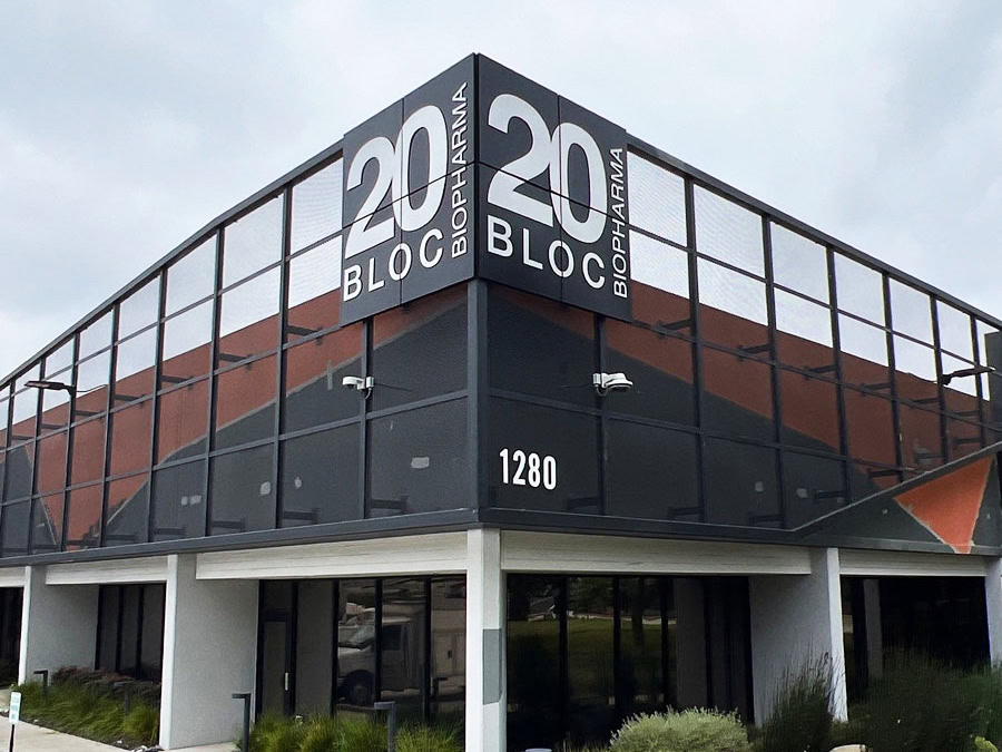
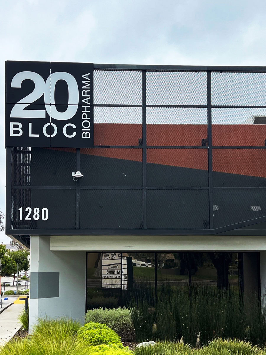
Corner-mounted building identification sign for 20 Bloc Biopharma in Thousand Oaks, CA.
Corner-mounted building identification signs help make 20 Bloc Biopharma easy to recognize from multiple approaches while reinforcing the company’s brand.

Why Your Building Is Part of Your Brand

Most businesses spend time developing their logo, website, and marketing materials, but overlook one of the first things people actually see — the building itself.

Your signage is often the first opportunity you have to communicate professionalism, quality, and attention to detail.

Before anyone reads a word on your website or hears a pitch from your sales team, they’ve already formed an impression based on how your building looks and how easy it is to navigate.

When every sign works together, your property feels intentional and well managed. When it doesn’t, even a great building can feel disjointed.

What Makes a Complete Office Building Sign System?

Most office buildings rely on more than one sign. They use several types of signage, each serving a different purpose while working together across the property.

Not every building needs every type of sign, but every building benefits from having a coordinated plan.

A complete office building sign system may include:

  • Building identification
  • Exterior branding and architectural graphics
  • Interior office signs and graphics
  • Wayfinding and directional signage
  • ADA signage
  • Monument and directory signs


Each piece plays a different role. Together, they shape how someone experiences your property from the moment they arrive.

The examples below show how these elements come together across different office buildings we’ve worked on.

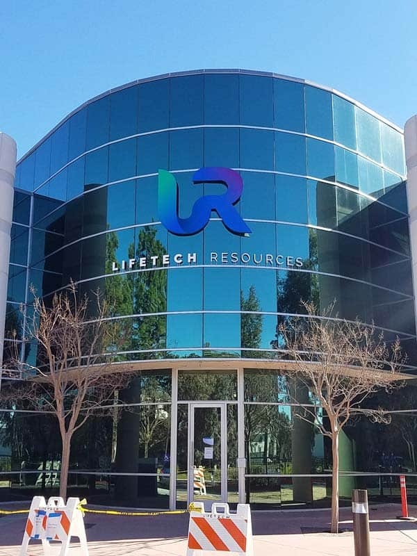
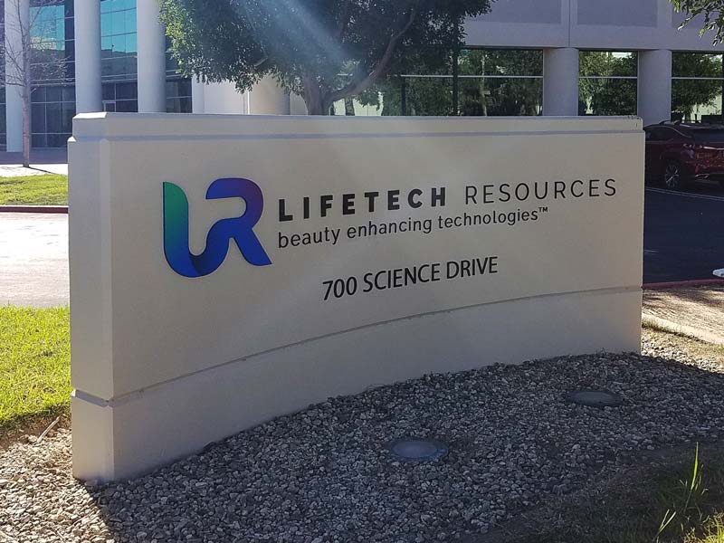
Corporate office building identification signs for LifeTech Resources in Moorpark, CA.
A coordinated office sign system often includes building identification, monument signs, and interior graphics that share the same design language.

1. Building Identification

Building identification is often the first thing people notice, and its job is bigger than displaying a company name. It should make the building easy to recognize from multiple approaches while reinforcing your identity.

Depending on the property, this might include:

  • Building-mounted signs
  • Dimensional letters
  • Individual letters
  • Backlit logo signs
  • Corner-mounted signs
  • Building numbers
  • Monument signs at the property entrance


The right solution depends on the building’s architecture, viewing distance, traffic patterns, and visibility from surrounding streets.

A sign that reads clearly at 20 feet in a parking lot may disappear entirely from 200 feet on a busy road.

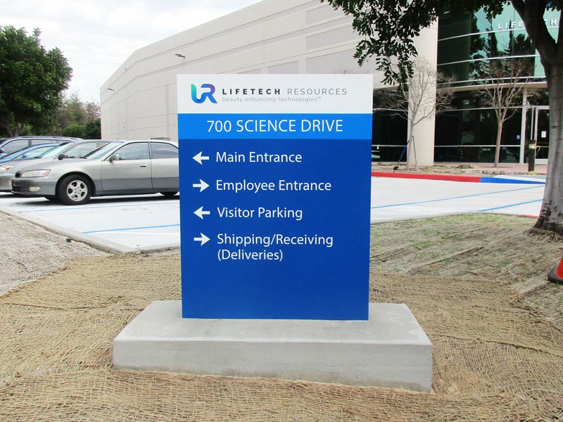
Corporate office building identification signs for LifeTech Resources in Moorpark, CA.
Monument signs help visitors identify the property before they even reach the building.
 
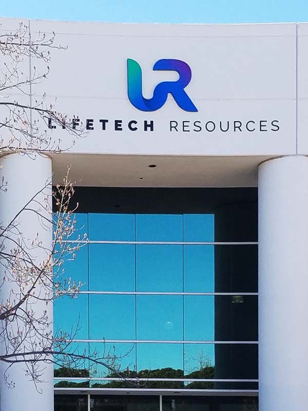
Building-mounted corporate identification sign for LifeTech Resources in Moorpark, CA.
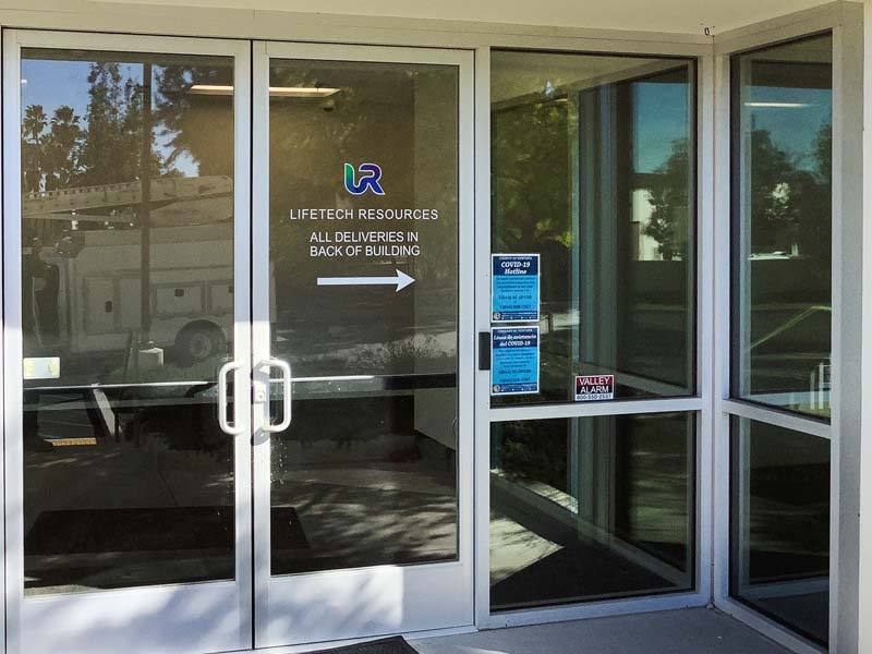
Building-mounted identification helps customers, employees, and deliveries quickly find the right location.

2. Exterior Branding & Architectural Graphics

Sometimes the building itself becomes part of the sign.

Large-scale architectural graphics can change how a property is perceived without altering the structure underneath it. On older buildings, they can give the exterior a more modern appearance without the cost of a full renovation. In multi-tenant properties, they help create a more unified look across the site. For new construction, they establish a recognizable identity from the very beginning.

When thoughtfully designed, architectural graphics don’t feel like something that was added later. They feel like they were always meant to be part of the building — and that’s what makes them so effective.

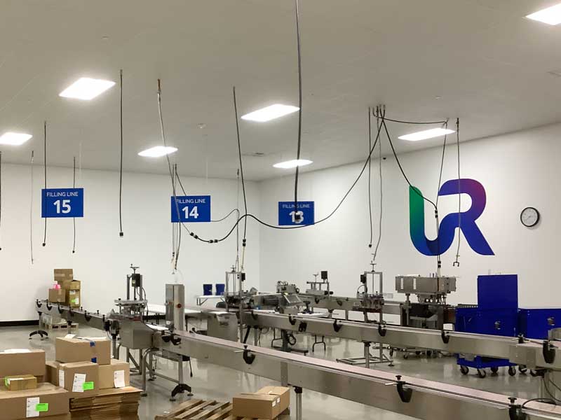
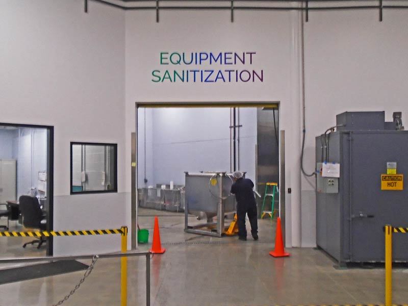
Interior warehouse graphics and aisle signs at LifeTech Resources in Moorpark, CA.
Interior graphics can reinforce a company’s brand while helping organize large workspaces.

Office door identification signs at LifeTech Resources in Moorpark, CA.
Office door signs help employees and visitors navigate the workplace with confidence.

3. Interior Office Signs & Graphics

A visitor’s first impression doesn’t stop at the front door.

Interior office signs and graphics carry your brand through the workplace while solving practical problems for the people who work there every day.

Common applications include:

  • Office door signs
  • Conference room and meeting room privacy graphics
  • Frosted, etched, or printed vinyl window graphics
  • Office and suite identification
  • Glass manifestation graphics (required in many buildings for safety)
  • Interior branding, wall murals, and lobby graphics


These elements do more than one job. They provide privacy and functionality while keeping the space visually consistent with everything a visitor saw on their way in.

Outdoor tenant directory sign at a commercial office property.
Directory signs help visitors quickly find the correct office, department, or suite.

4. Wayfinding & Directional Signage

Visitors, employees, delivery drivers, and vendors shouldn’t have to guess where they’re supposed to go.

Thoughtful wayfinding signage might include:

  • Building directories
  • Tenant directory signs
  • Suite numbers
  • Directional signs
  • Department identification
  • Parking and entrance guidance


Every property has different navigation challenges. A single-tenant building with one clear entrance needs far less wayfinding than a multi-building campus with several access points.

The right amount of signage is the amount that removes hesitation — not the maximum amount possible.

In larger office buildings and multi-tenant facilities, clear directional signage also helps people quickly locate entrances, exits, and shared spaces.

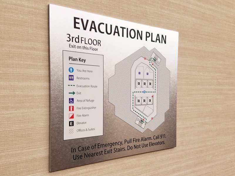
ADA directory sign
ADA directory signs improve accessibility while helping visitors navigate the building.
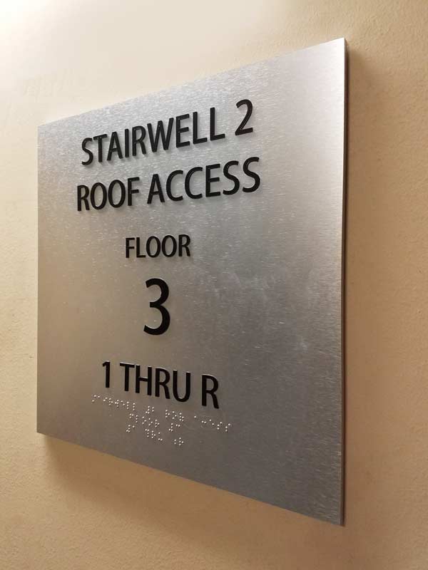
ADA-compliant tactile stairwell identification sign with Braille.
ADA room and stairwell signs provide clear identification while meeting accessibility requirements.

5. ADA Signage

ADA-compliant signage isn’t optional, and it’s easy to treat as an afterthought — a box to check rather than part of the overall design.

Done well, ADA signage doesn’t have to feel like a compliance requirement bolted onto an otherwise polished building. Room identification, restroom signage, and directional signs can meet code requirements for tactile lettering,

Braille, mounting height, and accessibility — including appropriate contrast for people with low vision — while still matching the building’s materials, colors, and overall design language.

Planning for ADA signage from the beginning also helps avoid one of the most common problems — having to replace signage later because compliance wasn’t considered early in the project.

6. Why Consistency Matters Most

This might be the most important part of a sign system, and it’s also the easiest part to get wrong.

It usually happens gradually. The building sign gets designed on its own. The monument sign comes from a different phase of the project. The lobby graphics are added later without much reference to what came before. Each element may look good on its own, but the property as a whole starts to feel disconnected.

A coordinated sign system avoids this by treating every element as part of one plan.

Building Identification → Monument & Entrance Signage → Interior Branding & Lobby → Offices & Conference Rooms → Wayfinding & Directional Signage → ADA Signage

When everything works together, the property feels intentional, professional, and well maintained. Instead of looking like separate purchases made over time, everything feels like it belongs together.


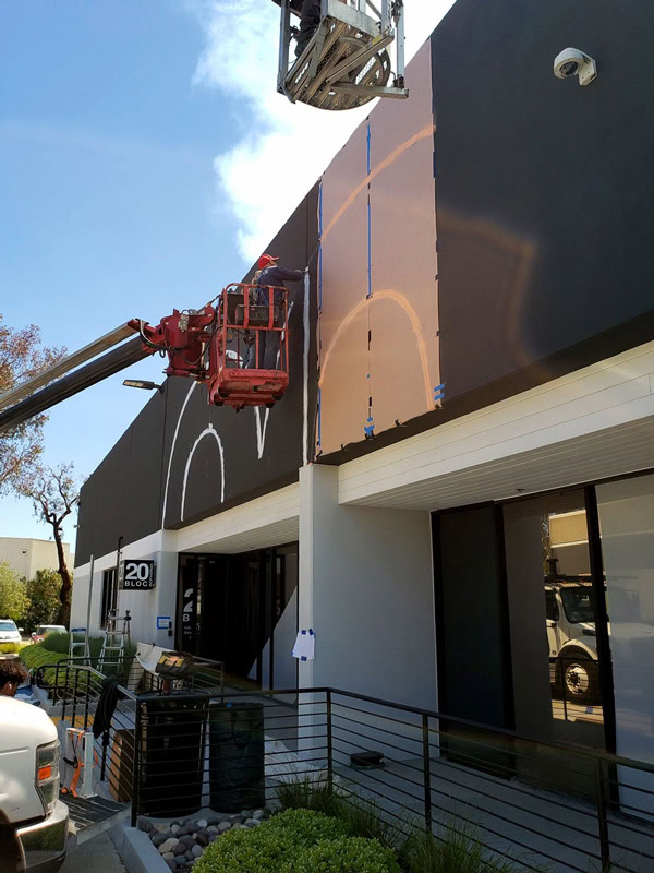
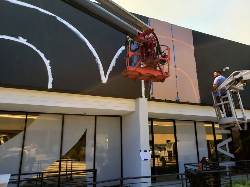
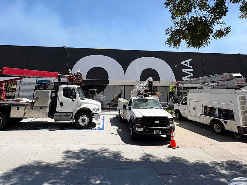
Crew laying out a hand-painted architectural graphic on the 20 Bloc Biopharma building.
Careful layout and hand painting help the finished graphic look like it was designed as part of the building from the beginning.

Featured Project: 20 Bloc Biopharma | Thousand Oaks

When 20 Bloc Biopharma updated its Thousand Oaks building, the goal centered on two things: making the building easy to recognize from the street and making sure the brand didn’t stop outside.

Not every office project includes every type of sign discussed above. The 20 Bloc Biopharma project is a good example of how a few carefully coordinated elements can create a cohesive experience.

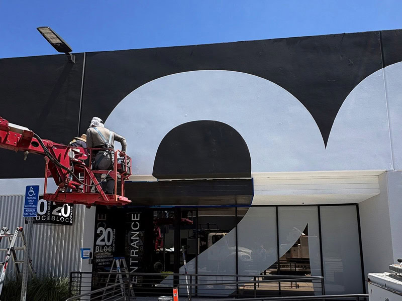
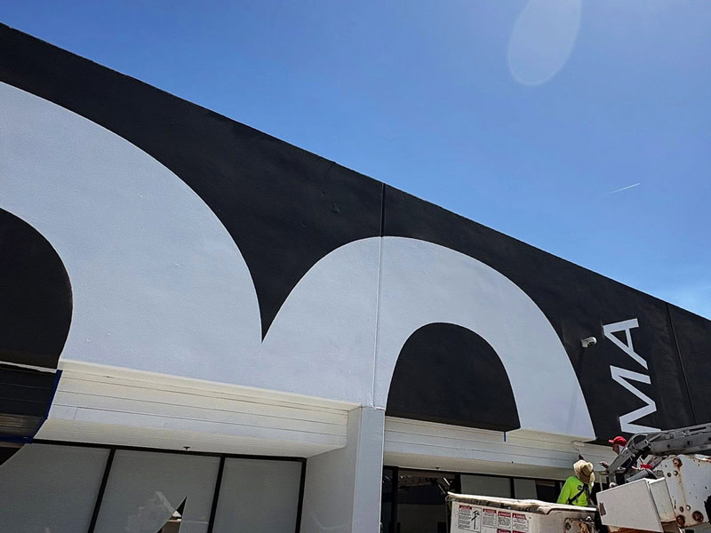
On the exterior, we installed large-scale building identification at the building’s corner — sized and positioned to be legible from multiple approaches — along with a hand-painted architectural graphic spanning the building’s façade.

Rather than applying a printed panel, the graphic was painted directly onto the building at full scale, requiring a coordinated installation crew working from lifts to execute it precisely.

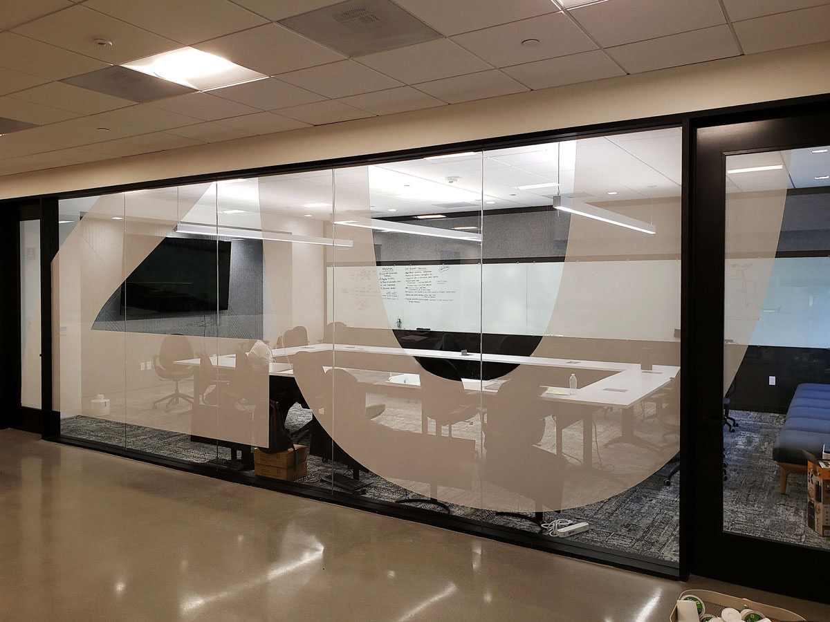
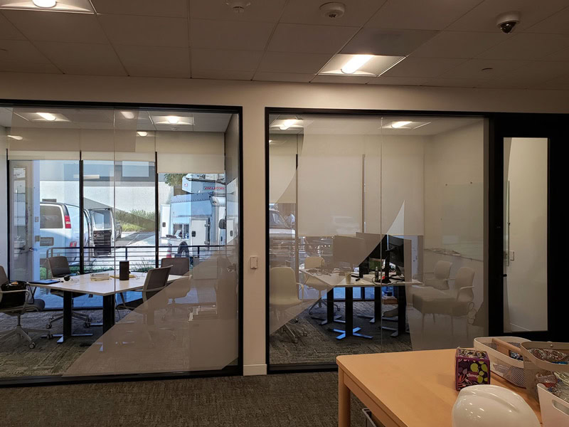
Inside, that same design language continues. Conference room windows feature custom frosted vinyl graphics cut in the same arch pattern as the exterior graphic, creating a visual connection between the outside of the building and the interior office space.

It’s a subtle detail, but that’s exactly what makes a coordinated office building sign system successful. Every element works together to create one consistent experience.

Crew painting a large architectural graphic on the 20 Bloc Biopharma building.
Large-scale architectural graphics can transform an ordinary façade into a recognizable destination.
Crew painting a large architectural graphic on the 20 Bloc Biopharma building.
Painting directly on the building creates a seamless look that’s difficult to achieve with applied panels.
Architectural graphic installation in progress at 20 Bloc Biopharma.
Stepping back reveals how the graphic changes the character of the entire building, not just one wall.
Frosted office window graphics used throughout the 20 Bloc Biopharma workspace.
Custom privacy graphics provide separation for meeting spaces while extending the building’s visual identity indoors.
Frosted privacy window graphics throughout the 20 Bloc Biopharma office.
Repeating the same design language indoors creates a consistent experience from the exterior to the workspace.
Completed corner-mounted office building identification signs for 20 Bloc Biopharma in Thousand Oaks.
The completed sign system combines building identification and architectural graphics into one cohesive first impression.

Planning an Office Renovation or Rebrand?

Every office building is different — different architecture, tenant requirements, branding standards, budgets, and timelines.

Some clients come to us with complete construction documents, architectural plans, and sign schedules already in hand. Others are just beginning to think through what their building needs.

Wherever you’re starting from, we’re glad to help you think it through.

From sign design and permitting to fabrication, sign installation, ongoing support, and navigating local building requirements, our goal is to help you create a sign system that reflects your business and performs well for years to come.

If you’d like to talk through your project, Give us a call at (805) 641-1387.

If you’d rather, you can also Request a Quote or Contact Us online — whatever works best for you.

Frequently Asked Questions About Office Building Sign Systems

 
What’s included in an office building sign system?

A typical office building sign system may include building identification, monument signs, architectural graphics, interior office signs, conference room graphics, wayfinding, directories, and ADA signage. Not every project includes all of these elements, but planning them together helps create a more consistent experience for employees, visitors, and tenants.
When should I start planning signage for a new office building?

The earlier, the better. Signage is easiest to coordinate during the design and construction process, before finishes are complete and permitting deadlines approach. Planning ahead also helps coordinate installation with other trades, avoid delays, and reduce unexpected costs later in the project.

Do office building signs require permits?

Some office building signs require permits, while others may not. Requirements vary depending on the sign type, location, size, and local regulations. We’ll help you understand what’s required before your project begins and can coordinate the permitting process when it’s needed.

How long does an office building sign project take?

Every project is different. A simple building sign may move much faster than a complete sign system that includes design, permitting, fabrication, and installation. Once we understand your project, we’ll provide a realistic timeline and keep you informed throughout the process.

Do you install ship-in signs?

Yes. We regularly install ship-in signs manufactured by sign companies throughout the United States. If you need an experienced installation partner in Ventura, Santa Barbara, or Los Angeles Counties, we’re happy to help.

Dave’s Signs Blog

This is a blog about signs. We highlight the different types of signs: signs we’ve created for our customers, history of sign design and today’s cutting edge sign technologies. Ask a question about signs, and you’ll likely find the answer here.

Case Studies

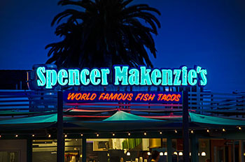
Spencer Makenzies Neon Sign

Here we go into detail on some of the custom signs we’ve done. Including Spencer Makenzie’s Neon Sign, Topper’s Pizza Neon Signs in the Oxnard Harbor, and The Historic Ventura Pole Sign. Check back with us. We’ll have more case studies of signs posted in the near future.

Custom Signs Near You

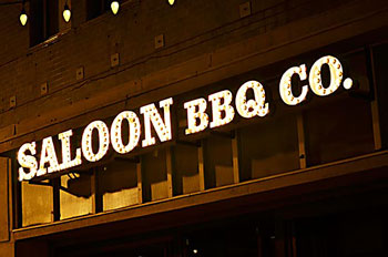
Saloon BBQ Custom Sign

We’ve designed, fabricated, installed and serviced signs all over southern California. Here are some highlighted areas near you including Ventura, Oxnard and Santa Barbara. Check back soon for more updates.

Call us today for an Estimate at (805) 641-1387 or

Request a Quote Online

Call us at (805) 641-1387


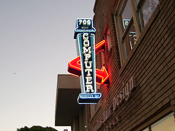
Neon Sign Design Computer

We Make Beautiful Neon Signs in Our On-Site Facility

Dave’s Signs has perfected the art of neon signs. We can handle all sizes of neon signage, from the small intricate signs to the eye-catching, large neon signs. Ask us for a personalized quote or contact us for any questions you may have about neon signage.

See Our Neon Sign Gallery


Dave’s Signs Makes Custom Office Signs

Whether you need a lobby sign, directional signage or ADA signs, Dave’s Signs can help you with all your office sign needs. We can use your logo and create a beautiful, distinctive sign for your office. We can also create custom building directory signs, suite signs, and directional signs to give the building a unique unified theme. Call us today to help you with all your office sign needs.

See Our Custom Signs

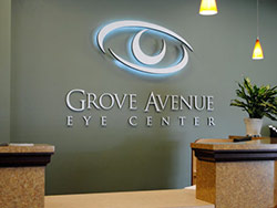
Custom Sign Design Grove Avenue