Why Simplicity Works with Bank Signs
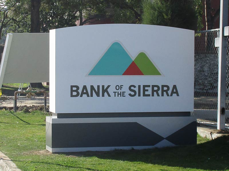
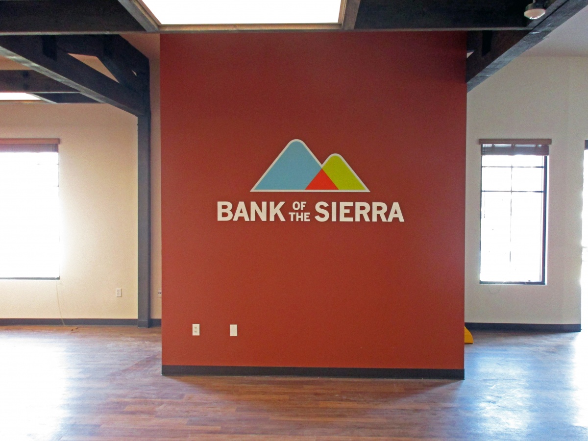
If you check out the signs we did for Bank of the Sierra, you’ll see a business name and logo. From outward appearances, these bank signs are quite simple, but don’t let this simplicity fool you. Sometimes, a direct and to-the-point approach works best when you want to attract current customers and make new ones. At Dave’s Signs, our designers have the uncanny ability to take important marketing concepts and translate them into simple and effective signage for your business. Here is what we mean:

The Value of Simplicity
Many times, people make things more complex than necessary to force others to think they are smart or clever. The truth is, simplicity is the most intelligent approach you can use. Albert Einstein once said, “If you can’t explain it to a six-year-old, you don’t understand it yourself.”
Look at the Bank of the Sierra signs again. A six-year-old can understand them. These bank signs give you all the information you need.
The Problem with Too Much Information
At the turn of the 21st Century, two psychologists (Iyengar and Lepper) conducted a study at Draeger’s Supermarket in Menlo Park, California. They tried two separate display strategies. First, they set out two dozen jars of jam to sample.
Later, they used the same display, but it only contained a half-dozen jars. The large display attracted more people, but the small display generated a lot more sales than the large one. What is the lesson here? Don’t overload your signs with too much detail, or you could overwhelm your customers.
When you come to Dave’s Signs, you have expert help designing, creating, and installing the perfect bank signs. We know how to keep it simple and highly effective. Discover what a professional sign company can do for you today. It’s as simple as picking up the phone and dialing (805) 641-1387.
